
The diplomatic neutral colour
What is a neutral colour?
Is it a pH=7 colour? A transparent colour? Greenish… brown? An oil colour… or maybe acrylic?
Conservators refer to the neutral colour inpainting when meaning: “I will paint the missing area with a single colour which you won’t see much”. It can be green, purple, pencil coloured or either with acrylic paints… it depends. The goal is that the lost area highlights the less possible regarding the artefact, and usually this colour is the same as the background, or as the surroundings of the loss.
The diplomatic neutral colour heads the first of a post series that intend to explain the eternal question: “What will you do with the losses? Will you draw the missing lines? Will you write the obliterated letters?”.

There is normally a common factor, and that is to previously clean and reinforce the loss (infill the support, the matter), and after that, once the “patient” is healed, it will go through the make up sessions (retouch, or inpainting[1], if needed, to give it a particular look. But controversial is on the cards in this second stage, and whatever we do, even when not doing anything at all, conservators give for granted that our decision will not suit everyone’s taste. And that is because criteria is subjective and ever-changing[2].
Fortunately I have this fail-safe application which gives me always the best solution.
Inpainting criteria in paper conservation: The neutral colour
The neutral colour inpainting belongs to the cromatic abstraction group, and it is usually applied in areas where the visual complexity of the loss is not excessive (i.e., there are not too many high contrasted colours, nor it lays on the critical area of what is represented), and thus it is quite simple to find a colour similar to its contour. But it is also used when in terms of ethics it is not recommended to do any hypothesis; for instance, because of the artistic value of the object, or because of not willing to completely hide the loss[3]. And there is still another possible reason: when it is not affordable to do any other kind of inpainting that might be too much time consuming. Neutrality lies in the not involvement, in the fact that nothing is drawn.
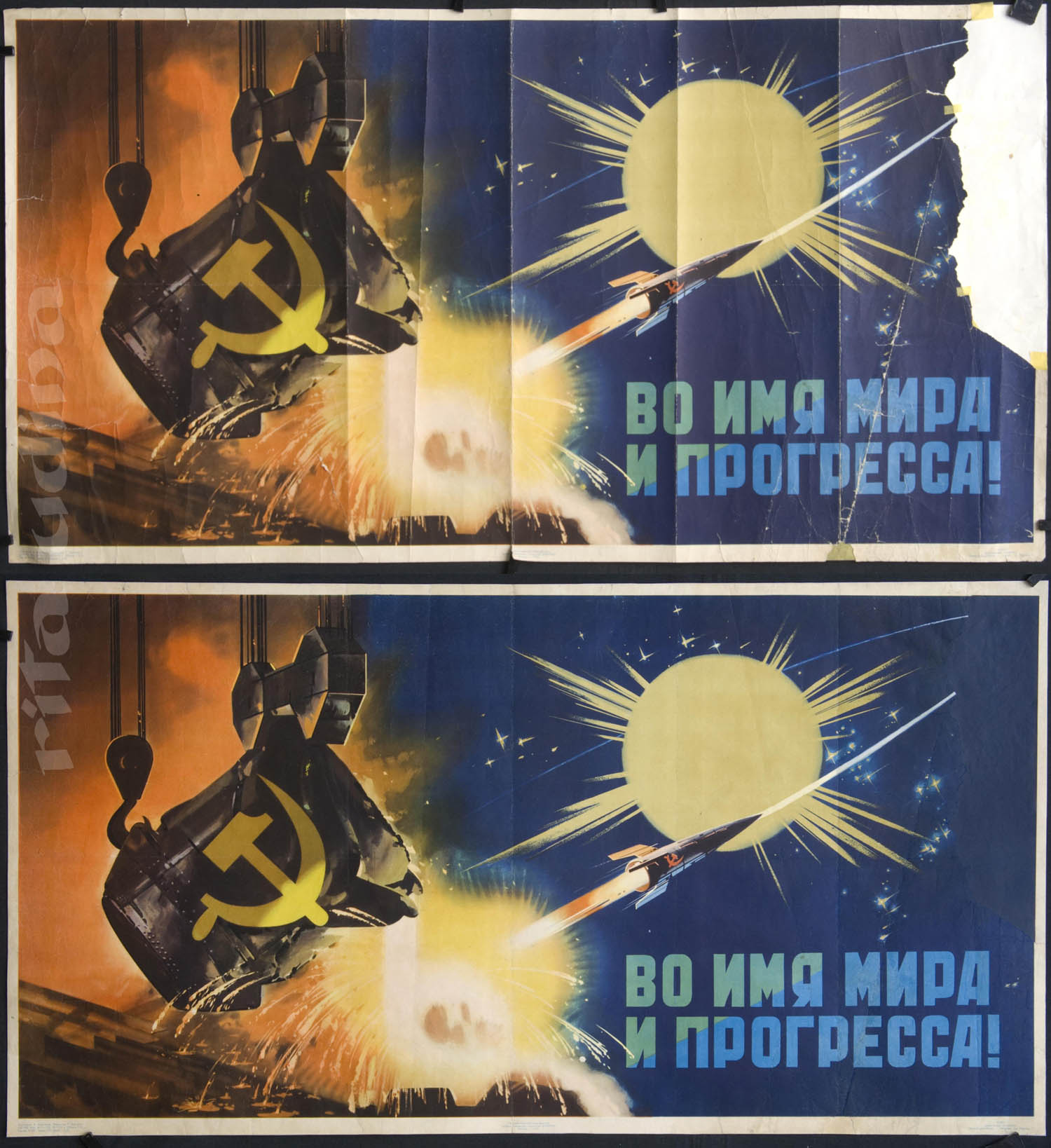
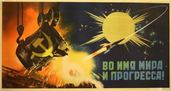
In this particular case it was not possible to find documentation about the original appearance of the poster[4], and a neutral colour was applied on the gap. On the one hand, because the dimension of the loss was notorious and annoying, as the old white patch had nothing to do with the blue background. On the other hand because the poster is worth of it (it will be framed and exhibited) and there is the advantage that the missing area doesn’t seem to be much complex: probably there was only the rocket elipse, and some other stars, a very small area regarding the overall of the loss. And finally, the neutral colour has been chosen because the function of the poster is to delight our eyes (and, in this case, by the way, make us enrole the communist party, in the name of peace and progress).
A neutral colour inpainting, as apolitical as it is, lets the observer imagine whatever is missing, from the discretion given by the similarity of itself and the contours of the artefact. The degree of resemblance of the neutral colour and that of the artwork will depend on how many colours adjoin the lacuna (only one in this poster: blue) and also on how much unnoticed we want it to be. In this case the background has a certain gradient (from dark, on the top, to lighter blue), and therefore the chosen blue is not exactly equal in almost none of the bordering spots, being then always distinguishable. The loss is not the protagonist anymore after inpainting the lacuna, and we can admire the print by itself, even when it is still clearly noticeable that both the trajectory of the rocket and some stars are missing.
After entering all data in the mentioned Application, it is concluded that the object, due to its condition and also to its esthetical and historical value and unicity, deserves a remedial conservation, or even a restoration[5] and not only a preventive treatment[6].

Valuation of the object:
- Antiquity: Medium (age 1959).
- Historical background: Medium-high relevance, since it belongs to a soviet posters collection of communist propaganda.
- Artistic quality: High
- Materials: Medium-low. A paper is not a ruby… but we are talking of a litography after all; the inks are good quality, and the paper has a reasonable good quality besides being a wood-pulp one.
- Uniqueness: Medium-high. A print is by nature, not unique,from which we can guess that there might be other issues somwhere else in the world, or there had to be some. But it is certanly unique in the collection to which belongs.
Condition:
- Does it work?: No. Or not fully, because it should be eye-catching, and our eyes would rather cry.
- Dimension of the loss: Big. This is one of the very few objectibely quantificable parameters. The loss involves a 4,8% of the print, and a 5,2% of the artwork (i.e., including the margins). And compacity, the fact that it is not spread in tiny parts, makes it even more visible.
- Feasable execution: Yes, we can certanly improve its condition, but since there are others a part from the loss, we will have to save resources when it comes to inpainting, and look for a not much time consuming solution.
And, particularly, valuating the big lacuna within the print:
- Location: It is not in the main focus, but parts of the drawing are cut.
- Complexity: Relative-low (we guess). It does’nt interfere the text, nor main parts of the feature. If we wanted to “finish” it, we could somehow do a copy-paste of a couple of stars and the remaining elipse. We cannot know the precise point where the curve turns, neither how many stars are missing and how where they distributed.
However, making an hypothesis about it could be considered venial in terms of the artwork because they are not main parts. On top of that we would be reproducing other parts, rather than creating. We would never consider to paint Saturn with its rings, nor Mr. Iuri Gagarin giving us a wink, from the far… And that doesn’t mean that none of these things could not be possible, it only means that it seems rarely predictable.
And excuse my being so nit-picking, but I can’t help taking my profession very seriously: We have assumed that the inky area is a rectangle, and that so is the paper, in other words, we assume that the fringe was white and rectangular shaped. If it turns that it was not so -which could happen- or that in the very spot of the gap there was precisely Iuri Gagarin giving a wink; the conservator would have had such a bad luck, the probability would have been so remote and unpredictable, that the poor conservator would then be exonerated from any accusation. And so the conservator should be able to sleep peacefully (but he would by all means not do so: he would spend the most horrible and sleepless night!).

From all this the conservator concludes that in this case the function is primary: if the poster is not nice at first sight, if instead of seducing us with its shapes and colours, what cathces our attention is the fact that there is a massive hole, then the poster doesn’t work. And therefore, instead of taking a deep breath and want to fly away on a rocket claiming for peace and progress, what we will do is think that communism is something from the past, completely devasted. But a proper neutral colour helps us seeing the whole thing with a more prudent attitude, and this is why it is worth to spend the time to match the right colour which will make the loss disappear.
And besides, the artisitc quality of the poster and the uncertainty of what’s absent made it preferrable not to put in the artist’s place by inventing something that we do not know exactly how it was (and not because we are not capable to paint a line and some little stars!). And it is less time consuming, without involving a drastic change in the final result, which is still “readable”, understandable.
What would you have liked in the gap to look like if that was your poster? Please do not hesitate to share your opinion, I am sure there are as many solutions as colours can be.
For those who thought that conservators use the brushes like hairdressers use the scissors (just any old way) I hope this post will show the lack of artistic outburst for the firsts.
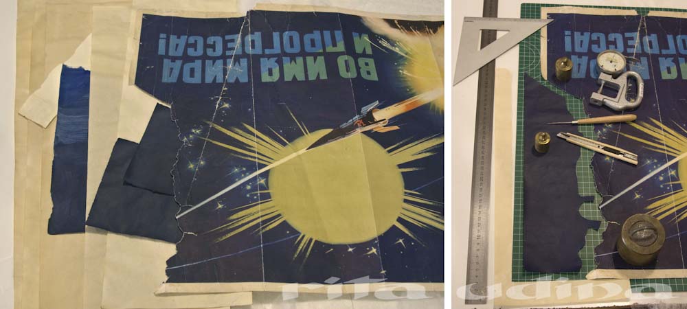
If you want to know more about this poster, know how the inpainting was dyed, who, for who, and all sort of photographic documentation about the conservation of this print, look at the PROJECT and click on each image.
Footnotes:
[1] See a wonderful explanation of the differences between retouch, inpaint and over-paint in this post by South Florida Art Conservation.
[2] Brandi,1963
[3] Such as the case of the Cimabue Crucifix from Florence, flooded in 1966. In that case it was considered better not to give many visual hints about the previous aspect of the loss, despite there was thorough and reliable information about it.
[4] I bet the minute I say that, hundreds of issues will suddenly appear… And, YES!!!! Here it is!
[5] Terminology is still quite controversial today, since restoration in english, might have the connotation of a non scientific work, opposed to conservation. However, it should not be:
“Remedial conservation – all actions directly applied to an item or a group of items aimed at arresting current damaging processes or reinforcing their structure. These actions are only carried out when the items are in such a fragile condition or deteriorating at such a rate, that they could be lost in a relatively short time. These actions sometimes modify the appearance of the items.
Restoration – all actions directly applied to a single and stable item aimed at facilitating its appreciation, understanding and use. These actions are only carried out when the item has lost part of its significance or function through past alteration or deterioration. They are based on respect for the original material. Most often such actions modify the appearance of the item”. (checked Jan. 2nd, 2017).
[6] American Institute for Conservation (AIC) (1997). Commentaries to the Guidelines for Practice. http://www.conservation-us.org.
Related content:
![]()
![]()

![]()
![]()
![]()
![]()
![]()

